SELFRIDGES design system
THE PROJECT
As a product / UI designer I worked on the Selfridges website and app redesign in a team of 3 UI designers, 3 UX and 1 creative lead as well as a 2 project leads in an agile environment.
THE CLIENT
Selfridges is a popular chain of high-end department stores in the United Kingdom. They are present online with a retail e-commerce shop bringing monthly traffic over 8M as well an app on both iOS and Android.
Content Landing Page - Beauty Edit
rebuilding the design system from zero
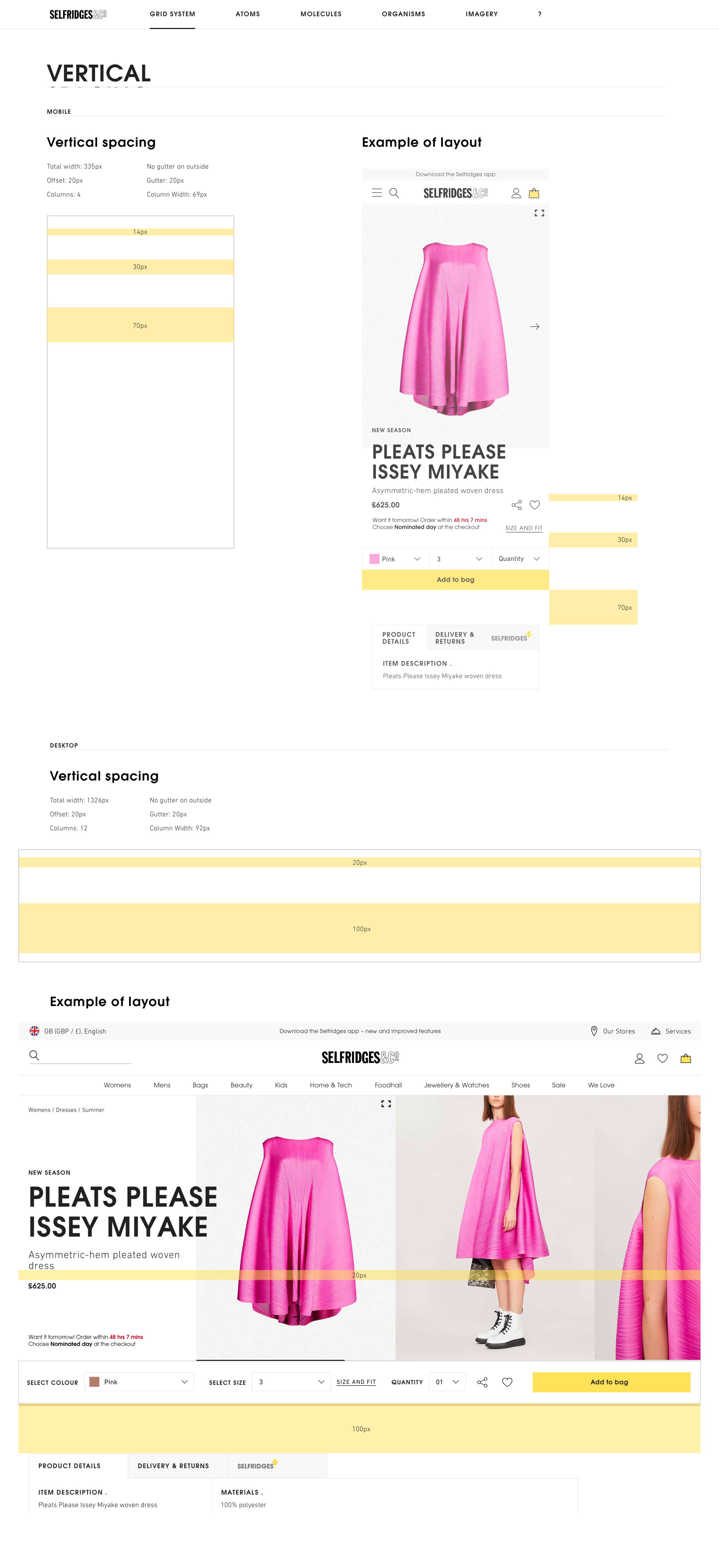
During my time at Selfridges I was involved in the style guide redesign for both responsive web and app. This involved a rework of the design system including the grids, atoms, molecules and organisms. We worked in sprints analysing current design system issues, DS components weaknesses, looking at benchmarking and exploring different design routes for the new improved design system.
Improving Selfridges Filters feature with a brand search options, sort by categories and sizing
IMPROVING THE SEARCH FEATURE
During my time at Selfridges I had a chance to explore a range of different UI components and core functions such as the Search feature. I looked at creating an enhanced search experience including Intuitive Search, Visual results, History and Recommendations.
Visual search and intuitive results
Location-based search - Introducing in store directory
Rethinking the search bar placement in app
Grids, layout and product cards
Looking at an improved and more informed design system meant spending several weeks focusing on the grid system and how it interacts with cards. Product cards are a big part of the e-commerce ecosystem. We wanted the cards to be intuitive while being able to display as much information as needed without loosing impact. That meant focusing on information hierarchy and looking at various cards scenarios.
As well as an overall redesign of the cards I also documented a large range of breakpoints and states that haven’t been explored before to add to the new design system.


